Ep. 294 | Let the Sentiment Be the Star | Easy Handmade Card Design Idea
Let the Sentiment Be the Star of Your Handmade Card
Sometimes we spend so much time choosing paper, colours, layers, and embellishments that the sentiment gets treated like the final little add-on.
But what if the sentiment was the whole point?
In this week’s card-making tutorial, I’m sharing a simple design idea where the background supports the greeting, instead of competing with it. This is a great layout for bold words, alphabet dies, big sentiments, celebration cards, Pride cards, birthday cards, thank-you cards, and those “I want this to feel special but not complicated” moments.
Because honestly, sometimes the sentiment deserves to sashay right into the spotlight.
Watch the Tutorial
The Card Design Idea
The basic idea is simple:
- Create an interesting background using strips of cardstock, designer series paper, or embossed cardstock.
- Choose a sentiment large enough to become the focal point.
- Use dimension, contrast, or a solid backing layer to help the sentiment stand out.
- Keep embellishments minimal so the greeting stays in charge.
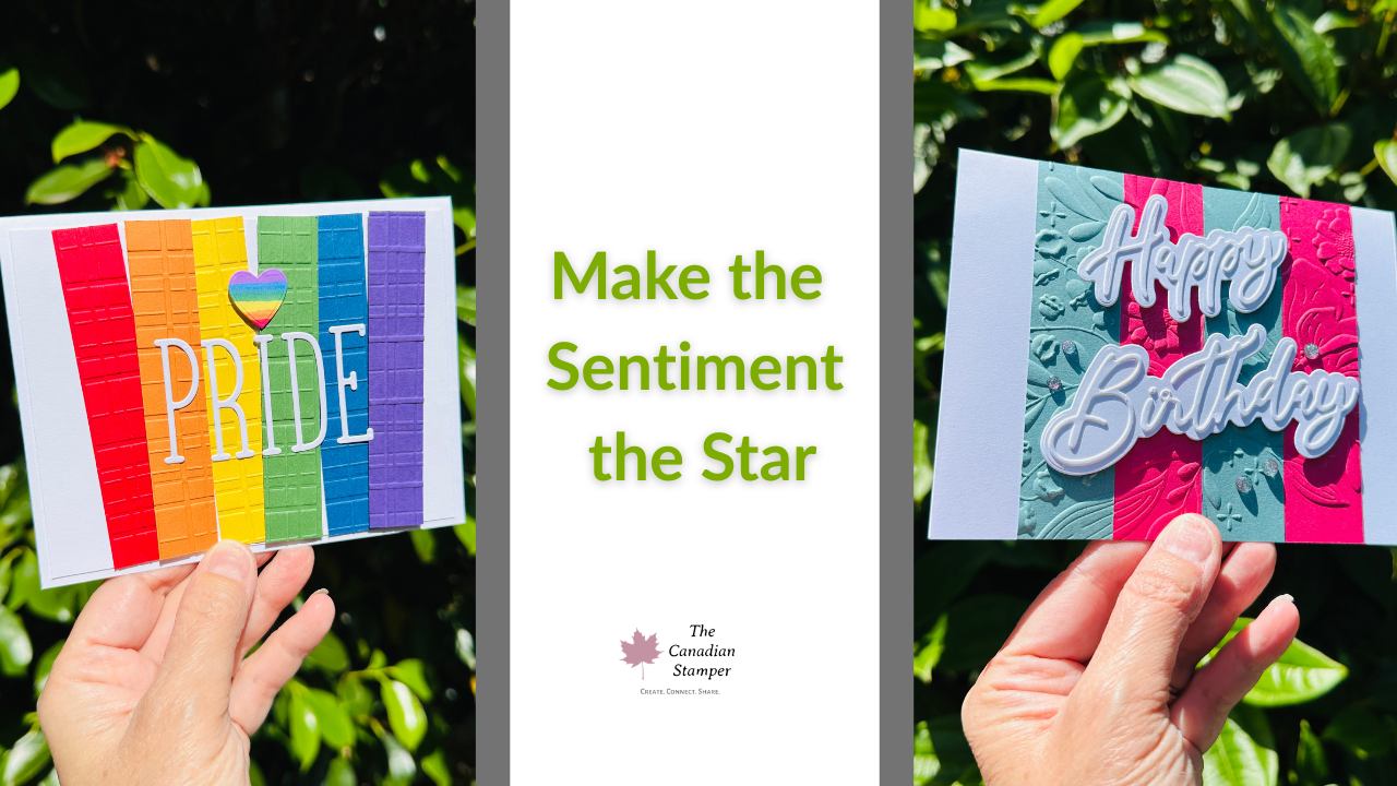
For the Pride card, I used rainbow cardstock strips as the background and added the word PRIDE using alphabet dies. The heart was created by colouring a strip with Stampin’ Blends and then die-cutting the shape. Simple trick. Big payoff.
For the birthday sample, I used the same design concept in a different colour combination. That’s the beauty of this layout: change the colours, change the sentiment, and you have a completely different card.
Card-Making Tip: Let the Background Do Its Job
A background does not always need to steal the show.
In this design, the background adds colour, texture, and movement, but the sentiment is still the star. If your greeting starts to disappear into the design, try one of these fixes:
- Add a solid colour layer behind the sentiment.
- Use white-on-white or tone-on-tone layers for contrast.
- Pop up one part of the design with dimensionals.
- Keep embellishments simple or skip them altogether.
That last one matters. Not every card needs gems, ribbon, sparkle, twine, sequins, and a small parade. Sometimes restraint is the design choice. Rude, but true.
Colour Combination Tip
If choosing colours makes you stare at your cardstock like it owes you money, start with one colour you love.
Then choose:
- one colour that works with it,
- one neutral,
- and one accent colour if needed.
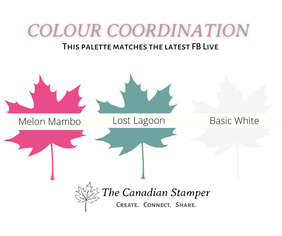
For the birthday sample, I started with Melon Mambo and paired it with Lost Lagoon. For the Pride card, the rainbow colour palette did the heavy lifting.
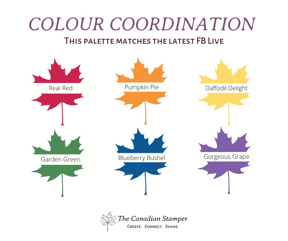
If colour choices tend to overwhelm you, I made a free guide to help.
Download the free No-Overwhelm Colour Coach here:
Get the No-Overwhelm Colour Coach
Supplies Used
Here are the main products featured in this tutorial:
- Words & Wishes Stamp Set and Dies
- Simple Alphabet Photopolymer Stamp Set
- Hope, Love & Joy Dies
- Forever Plaid 3D Embossing Folder
- Basic White Cardstock
- Rainbow cardstock colours or designer series paper
- Stampin’ Blends, pencil crayons, or colouring tools for the heart detail
In Canada?
You can shop Stampin’ Up! products with me here:
Shop Stampin’ Up! in Canada
Want More Card-Making Confidence?
If this project helped you see how one layout can become several different cards, your next step may be the Card Multiplier Workshop.
It’s designed to help you take one card idea and turn it into multiple finished projects without starting from scratch every time.
Learn more about the Card Multiplier Workshop
June Classes
If you’d rather have the cutting, measuring, and project planning handled for you, check out this month’s class options.
Craft & Chat is the relaxed, approachable card class with prepared projects and digital options available.
Canadian Crafting Circle is the deeper-dive class for crafters who want more product exploration, technique, and guided project instruction.
View Canadian Crafting Circle options
Final Thought
The next time you make a handmade card, try starting with the sentiment first.
What do I want this card to say?
Then build the design around that.
Your sentiment might just be ready for its main character moment.